Tuesday, December 1, 2009

My Favorite Photos of the Semester


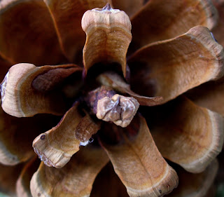
I liked this photo because it's a different view of a pine cone than you usually see. I was trying to make it resemble a flower. I was at Zimmerman Park when I took the shot and used the macro setting on my camera. I cropped it down to cut out some distracting elements in the corners and I also used a gradient filter in the corners to darken the bright spots. I darkened the overall image by adjusting the histogram and I used a warming filter to bring out the oranges and yellows of the pine cone. I wish that the foremost part of the cone was more in focus, but I'm generally happy with how it came out.


I shot this dead yucca plant with my macro setting at Zimmerman Park. It's a color photo but naturally looks black and white, which I liked. I also like the abstract design and detail of the fibers in the image. I adjusted the histogram to bring out more detail and used a warming filter on this image, but that's it. I am happy with how it turned out I just wish I could have taken a longer exposure to capture some of the detail that got blurred.

This is my favorite image that I took this semester. I love the color of the rose and the detail in the petals and water drops. This was on Rocky's Campus in front of the Eaton Administration building. I used the macro setting on my camera and cropped in on the rose when editing. I also used a gradient filter on everything but the rose petals. I adjusted the histogram to bring out detail and I saturated the red a little so that it would pop more. I wish I had a nicer camera so I could have blurred the background out more but other than that I really like this image.


I liked this photo because I thought it was a privilege to see so many pronghorn together. Apart from the bison in Yellowstone I've never seen such a large herd of ungulates. I was on the Rim Country Institutes land and used the landscape setting on my camera. I cropped in on the herd when editing and used a gradient filter on the top and on the bottom to darken those areas. I also adjusted the histogram which helped bring out more detail in the pronghorns. I used a warming filter which I thought went well with the color of the fur, grass and rock. I again wish I had a nicer camera with a telephoto lens, so I could zoom in closer to the animals and get a more intimate shot. I also wish my camera had better photo quality because cropping in as much as I did created some noise that I wish wasn't there.

This was probably my second favorite photo that I took over the semester. This was at a campground on the way to Yellowstone in the Beartooth Pass. I used my landscape setting and a gradient filter on the sky. I did some adjusting to the histogram as well. I used the clone tool quite a bit on this photo. I cropped in to cut out some of the plants and distracting elements on the bottom of the image but I didn't want to crop anymore than I did so I was obliged to remove some leaves, twigs and a post from the bottom of the image. I love the reflection but I wish it was more clear. I also wish I was capable of taking a longer exposure to capture some more detail in the distance.


Photoshopping

I'm not blogging about the last chapter of our book that covers the same topic, but about my own personal experience with editing my photos.
I've never photoshopped any of my photos until last week. I used the Adobe Elements program in the Wood's Lab on campus and I had a great time tweaking my photos to make them look better. I have to say that I am overwhelmed with how much better you can make a photo look with only 20 minutes or so of work. After I got the hang of it, the only reason it really took me that long was because I'm a fairly indcisive person and I kept tinkering with things and jumping back and forth between ideas. The thing I had the most trouble with was deciding whether or not to use a warming filter or a cooling filter or none at all. I found that 9 times out of 10 I opted for the warming filter if I used either. I think that the cooling filter created a more unnatural feeling to my photos while the warming one highlighted my images, but I have to keep in mind that most of my photos incorporated yellows, oranges and reds, so a warming filter went better.
The clone tool is probably the coolest thing ever, at least as far as photoediting is concerned. It was so easy to use and before I knew about it I was ready to forgo some of my images because of little human elements that ruined them, but the clone tool came to the rescue and I was able to remove them.
The two things that I utilized the most were gradient filters and adjusting the light with the histogram. With these two tools you can turn any decent photo into a good or great photo. I don't remember what Adobe calls it, but I call it the spot gradient tool or being able to place a gradient tool over certain parts of the photo without darkening the rest. This came in handy when I had an extremely bright or washed out spot in a photo and I was able to darken it so that it wasn't too distracting, while not darkening out the main subject which I wanted to remain bright.
I've determined that for my photography needs I need to buy two things before I even purchase a new dslr. First I need a new powerful laptop and second Adobe Photoshop software. I can work with my point and shoot and still produce images that I think turn out nice, but to edit them so that they become great (in my opinion), I need a better computer and Photoshop. That new dslr seems even further away now, but I know that my current computer can't hack it with the file size of the raw photos or with the amount of memory required to run Photoshop. My only solution is to win the lottery.
On a different note, I want to thank Dave for all his help and information in getting me on my way to becoming a better photographer. I've always wanted to take a photography class and I feel I learned a great deal of useful information during the semester that will come in handy on my future adventures. Thanks!

Student Art Exhibit

I went to the art exhibit with my girlfriend and she really enjoyed Krista's flamenco dress exhibit. She spent a few years living in Sevilla and went to La Feria with her friends so it brought back some memories for her. For my part I thought the paintings were pretty good, I liked the use of colors especially the Sevillanas painting that she made her postcards of. The dark blue and vibrant red contrast in a beautiful way.
The fashion exhibit was cool but not my cup of tea. I did like the portrait painting but the rest didn't really suit my palette. My girlfriend works with Monica so she was excited for this exhibit too.
Cassie's exhibit "99 Pills," I found depressing. I think that was the effect she wanted and it made me feel really sorry for her having rheumatoid arthritis at such a young age. I liked the multiple painting styles used for the same image, especially the 50's style comic version. The thing that moved me the most was the guitar with wire and nails wrapped around it. I'm learning to play the guitar myself and I can't imagine how difficult it would be to play with arthritis.
To sum up I'm not too fond of the abstract art on exhibit, but I did find some things that were interesting in all the exhibits and I can appreciate the messages and imagery that they were trying to portray, but it's definitely not my type of art.

Wednesday, November 18, 2009

Why can't I get paid to do this?

By a stroke of luck my blogging assignment was extremely easy this week. I brought up my yahoo browser and there was an article about photoshopping a photo of Demi Moore, that went extremely wrong. Just so everyone knows I don't follow fashion photography and I know that this has nothing to do with nature photography, but I thought this article was fitting since we are discussing editing photos in class.
In the photo part of Demi's left hip seems to vanish, while her clothing remains in the place where her hip should be. I have to agree with the sentiment of the article, how could such a blunder go unnoticed? Especially on the cover of a magazine when I'm sure whoever was involved in the editing made a ton of money. I guess I just find it amusing more than anything. It also teaches the lesson that if you're going to manipulate your photos make sure you pay attention to what you're doing. Trying to manipulate and remove objects can create gaps or holes in your photo that can ruin an image, regardless of the type of photography you're involved in. I've posted two different links covering the same topic below, if you're in the mood for a little amusement.

Thursday, November 12, 2009

My Pick


My favorite images of the day were used for other assignments, so I was kind of left with this one. Not to say I don't like it, but I liked others more. This one I shot with the macro setting on my point and shoot camera. I like how it shows depth and how it's framed. The red branch draws your attention and the focus draws you back and down to the main subject the water drops which point down to the yellow branches that lead you back upward to the red branch it forms a kind of circle brining you back to the main subject the water drops.

Rule of Thirds


I took this photo trying to adhere to the Rule of Thirds. I used the landscape setting on my point and shoot camera. Vertically I tried to line up the larger rock in the left third, the closer bush in the right third and the background in the middle third. Horizontally I tried to get the smaller rock and leaves in the lower third while catching the bushes in the middle third and leaving the upper third for the uninteresting background elements. I think it came out alright for what I was trying to do.

Detailed Close Up


This is probably my favorite photo that I took this afternoon. I shot this picture using the macro setting on my camera. I thought about using it for my "red" assignment, but it was the best close up I had so here it is. I really liked the detail of the flower and how it stands out against the dreary background. The water beads add an extra element to it's beauty as well.